

Mendly
Mendly is a mental wellness companion for the quieter end of the day. A small illustrated mascot greets you, asks how you are doing, and opens a calm grid of care categories, breath work, mindfulness, therapy prompts, movement, relaxation. The whole product is dressed in hand-drawn botanicals and cloud pastels, so opening the app feels like stepping into a garden, not a clinical tool.

The Challenge
Most wellness apps feel like productivity software in sheep's clothing, streaks, stats, push nags. That works for habit trackers, not for someone trying to sit with a difficult feeling. Mendly needed to feel soft first and capable second, without losing the structure that makes a daily practice stick.
The Solution
A React Native app built around a single calm home screen. A greeting block sets the tone, an Essentials grid surfaces the care categories, a Next Up card nudges the current practice, and a small three-item intention list sits underneath. Every icon, card, and background is hand-illustrated in the same botanical style so the app never breaks character, from splash to session.
At a glance
0
Care categories
0
Daily intentions
iOS
Platform
Concept
Status
Colour Palette
Botanical greens, daisy cream and warm botanicals. Fern sets the app surface, warm sand holds the cards, olive anchors the type, and a peach blush steps in for accents.
Olive
#6B7A4A
Logo / text
Fern
#8FA07A
App bg
Sage Mist
#B8C9A8
Promo bg
Warm Sand
#D4C898
Card bg
Peach Blush
#E8A882
Accents
Full palette flow
Behind the Build
A closer look at what makes Mendly feel like a companion, not an app.
Soft, supportive, and personal
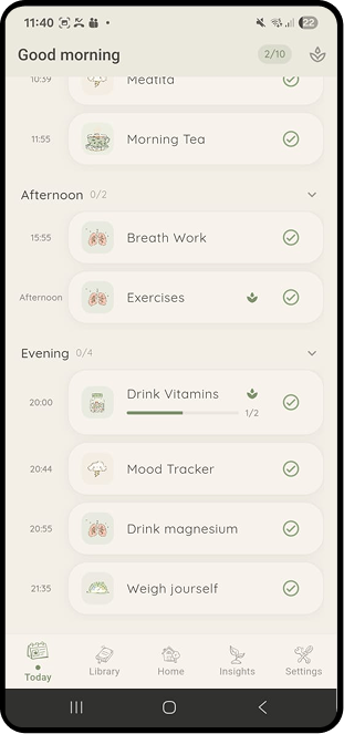
Mendly is built around a friendly sage colour palette and a warm, approachable interface. Every screen is designed for people managing real health challenges, gently motivating them to take care of the basics without ever feeling overwhelmed. A small companion character greets you on every screen, not as a gimmick but as a presence that makes the app feel like someone is in your corner. When things get hard, Essential Mode strips away everything except the absolute necessary tasks for the day. One tap, less noise, just the care that matters most.
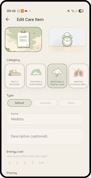
Build your care routine, schedule on your terms
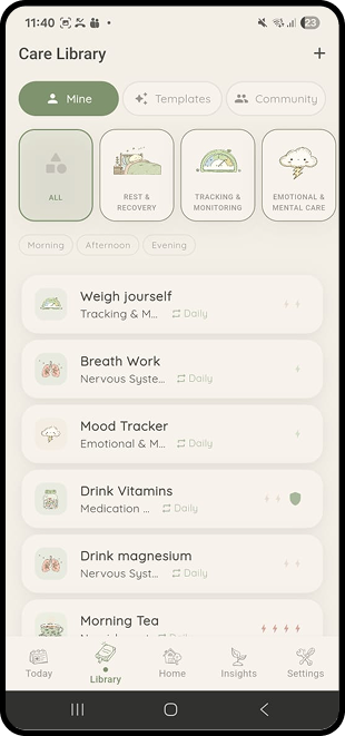
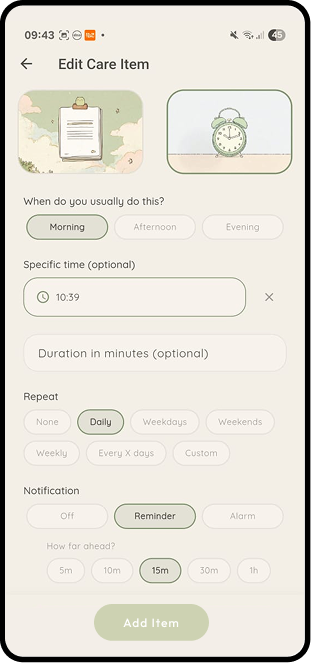
Every care item is personal. Pick a category with hand-drawn illustrations, choose how it works (checkbox, subtasks, mood tracker, or breath work), and set the energy cost. Then schedule it your way. Morning, afternoon, or evening. Daily, specific weekdays, every few days, or custom. Duration is optional because sometimes care is five minutes, sometimes it is an hour. Reminders are there if you want them, never pushy.
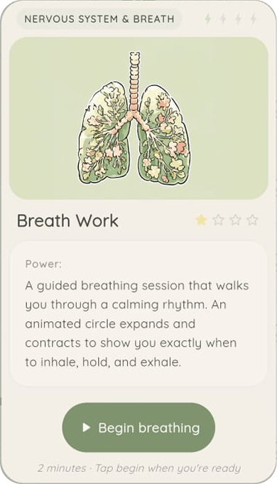
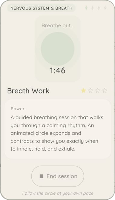
Guided templates that make care feel easy
Mendly ships with ready-made templates for breathing exercises, meditation, mood tracking, and more. Each one guides you through the experience with friendly animations and clear visual feedback. Pick a template, tap start, and follow along. No setup, no learning curve, just care that feels like it was designed for you.
AI-powered insights that stay safe
The Insights tab generates wellness observations from your completion data and mood trends. A weekly bar chart, a domain breakdown by category, and a mood trend line give you the picture at a glance. Ask Mendly anything through the chat-like interface. Every AI response passes through a tone filter before it reaches you. Medication names never leave your device. Only anonymised stats are sent for analysis. Alerts flag important patterns like missed medications, but the language is always gentle, never clinical.
Design Direction
The mood was pulled from storybook endpapers, old botanical prints, and the colour of a sage field at dusk. A serif sets the greetings, a soft sans carries the body, and every surface is rounded. Animation is kept to gentle fades and the mascot's blink, warmth comes from the artwork, not from motion.
Why it stays on one screen
A wellness app you have to navigate is a wellness app you abandon. Mendly keeps the daily loop on the home screen, check in, pick an essential, honour the three intentions. Anything deeper, long sessions, history, therapy content, lives one tap away but never fights the home screen for attention.
“It needed to feel like opening a window, not opening an inbox.”
Design notes
Mendly
Technical Stack
Flutter cross-platform build with Supabase backend and offline-first architecture.
Flutter
Framework
Dart
Language
Supabase
Backend
GetX
State
Hive
Offline Cache
Edge Functions
AI
Custom Illustration
Brand
Quicksand
Typography
How We Got Here
Mood
Started from storybook art and botanical prints, not from competitor apps. The first asset shipped was the mascot, everything else was drawn to sit next to it.
Home first
Designed the home screen before any other flow. If the daily loop did not feel calm on that one surface, nothing else would save it.
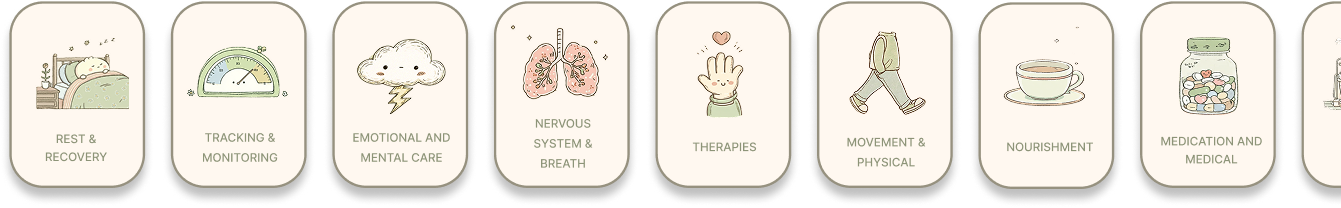
Categories
Eight care categories drawn on the same day, in the same session, so the icon set feels like one hand rather than a collage.
Forget Me Not
A digital memorial platform where families create lasting tribute pages for loved ones. Includes a physical NFC-enabled memorial tag that links to the online page, connecting the physical and digital in a beautiful, floral-themed experience.
Next buildThe Paperback Society
A trust-first second-hand book marketplace for South African readers. Scan, list, chat, pay into a wallet, ship by locker or courier, and settle disputes inside the same thread.